
A wallet to pay bills,
scan QR codes, and earn rewards.
Product design for an app built for the Paraguayan market: bill payments, QR payments, and linked payment methods, all in one place. It never launched under its original brand — it ended up becoming a white-label product for cooperatives and financial institutions.
This project is covered by a confidentiality agreement with the company it was designed for. Real names, brands, logos, and data have been replaced with generic elements; the screens below are portfolio reconstructions, not real product screenshots.
From bill-pay app to white-label product
The original idea was simple and in high demand locally: one app to pay phone, electricity, or internet bills, pay with QR, and link cards or wallets — earning discounts and promotions from partner merchants along the way.
The app never launched under its own brand. The company behind it pivoted the product and started offering it as a white-label solution instead: cooperatives, financial institutions, and small finance companies could take the existing base and customize it with their own logo and color palette.
That shift changed what the design work actually was. It stopped being about designing one app, and became about designing a system that could be reskinned quickly for different clients without losing usability or consistency.
What the design had to solve
A clear, low-friction bill-payment flow for a broad audience, not necessarily experienced with financial apps.
The real constraint
The entire visual system — color, logo, brand typography — had to be swappable per client without rebuilding the screens.
No public metrics
Since it was never launched under its own brand, this case study focuses on process and design decisions, not usage results.
Paying a bill, start to finish
The core of the app: pick a provider, enter the bill details, confirm the payment method, and walk away with a receipt. Five steps, designed to be completed without friction.
Pick a service
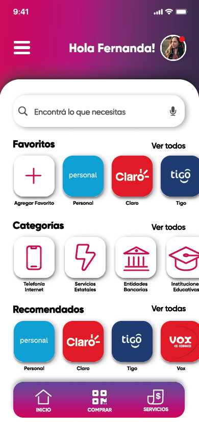
Clear categories: telecom, government services, banks, insurance.
Enter the details
Account or phone number, with an option to scan the bill instead.
Confirm the amount
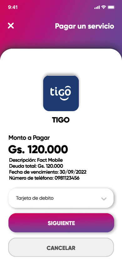
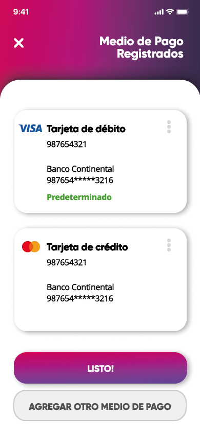
Bill breakdown and a saved payment method to choose from.
Verify with a PIN
Authorization through a transaction PIN or fingerprint.
Get a receipt
A digital receipt, downloadable and ready to share.
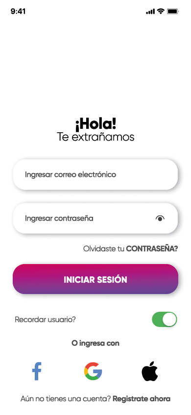
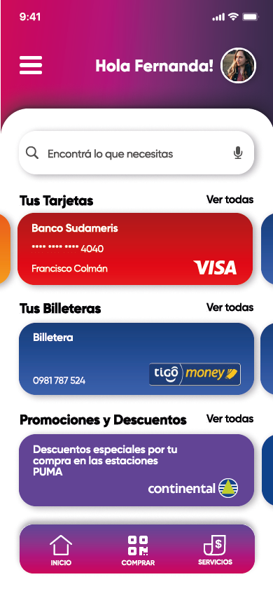
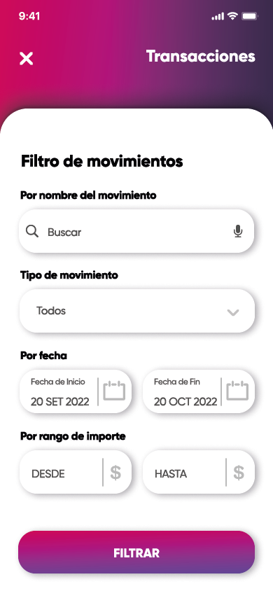
Actual design screens from the project, reviewed for this case study. Real brand marks and account details have been replaced with generic placeholders under the NDA above.
What this project taught me
Designing to be resold
Learning to think in brand tokens instead of fixed screens, so one product could look different for each licensed client.
Simplicity above all
The bill-payment flow was tested and refined so anyone could complete it, experienced with financial apps or not.
Design outlives the pivot
Even though the app never launched under its original brand, the design system stayed alive as the product's commercial foundation.